



Inside De La Calle's Frutas Campaign: Sourcing the Most Vibrant Fruits
2 min read

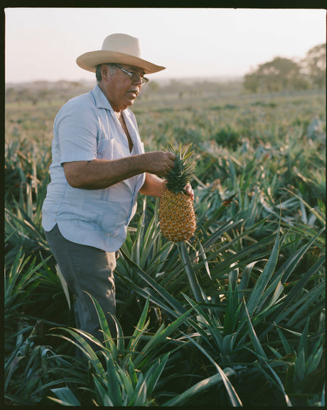
Every can of De La Calle starts with real fruit. For a long time, though, you couldn't necessarily tell that just by looking at the shelf. Our Frutas campaign changes that — and it's one of the most significant brand evolutions we've made since launching in 2021.
THE IDEA: SHOW, DON'T JUST TELL.
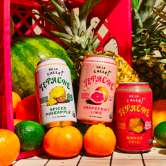
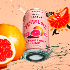
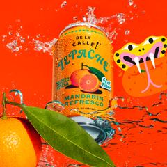
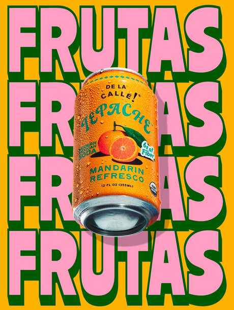
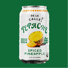
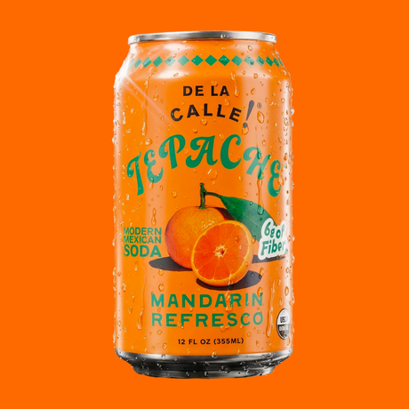
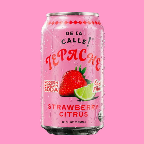
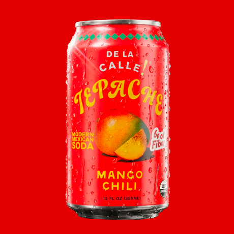
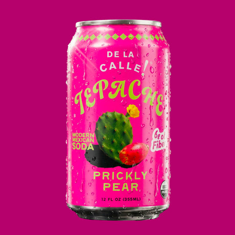
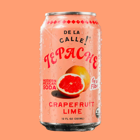
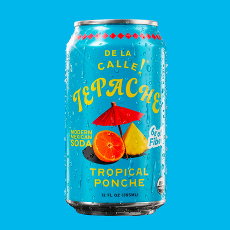
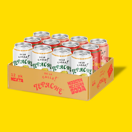
Tepache is made from real pineapple, and certified organic ingredients. But our previous can designs leaned on bold typography, color blocking, and brand graphics — gorgeous, but more abstract than literal. A new customer scanning the shelf had to read the label to understand what they were about to taste. The Frutas campaign flips that. We redesigned our cans to put the fruit itself front and center — vivid, juicy, designed in a way that makes the flavor inside immediately legible at a glance. If it's Mango Chili, you see the mango. If it's Cactus Prickly Pear, you see the prickly pear. The goal is simple: one glance at the shelf and you should already be thirsty.
A can redesign sounds simple until you're the one trying to make a design of a mango look more delicious than the real thing. That work fell to our creative teams' hands, who led the campaign's visual execution.
This wasn't just a packaging refresh - it was a statement about what De La Calle actually is. We're not a flavored seltzer brand dressed up in nostalgic graphics. We're a fermented beverage company built on real fruit, and the new can design exists to make that obvious in under a second of shelf time. It also gives us a much stronger foundation for marketing. Designs that highlights the fruit translates beautifully across social content, in-store displays, and paid media - it's the kind of visual that stops the scroll because it looks, frankly, like something you want to drink right now.
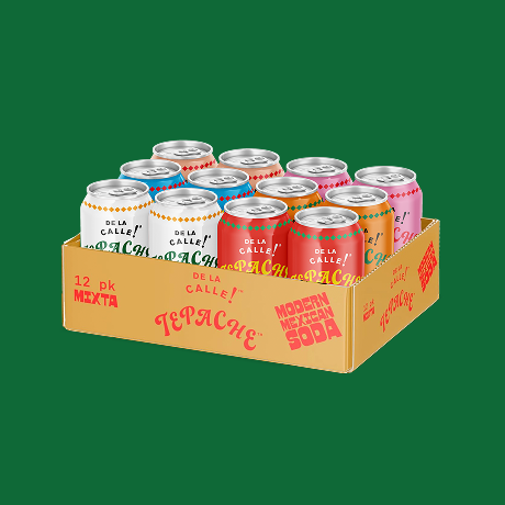
The Frutas campaign is the new visual standard for De La Calle going forward — every new flavor we launch will carry this same fruit-forward design language. As the team continue rolling it out across our full lineup, we'll keep sharing the process here on the blog. This is what De La Calle looks like now: the fruit, right up front, exactly as delicious as it tastes.